Tuesday, 25 April 2017

Overall Evaluation

Overall the booklet is partly successful as it sticks to its theme and is consistent throughout and appeals to the demographic set which was young professionals and students. The slogan and the playful type really fit the concept well and summaries it well. However it fails to carry extensive information on there, this can be seen as good or bad in terms of design because It keeps the structure very basic and not filled it with writing. But to the naked eye picking this booklet up I would be confused to what is the real point and what it is asking of me. To improve in the future a  website would be made alongside it so that the booklet would just hold the key points and would direct you to the website for more information.

I found COP 1 overall very interesting and insightful to work and believe it has enhanced me in other aspects of my work bringing better research and then better concepts. Learning how to search for certain things and apply them in the proper way to create the best outcome for myself, to improve in the future I would utilise my research more and experiment with different approaches instead of just choosing and idea and sticking to it.

Study Task 8


Study Task 6

Initial Ideas

I started of my initial ideas by writing down slogans in various type, I wanted the tag line to be really strong to draw people in. The first idea I had for the campaign was green Friday, which would be a parody of black Friday which is the biggest day in the consumerist calender. The idea behind would be give up things on green Friday instead of gaining things like black Friday. The next slogan was ‘Love people and use things, not the opposite. I like this was because it is very blunt and personal and perfectly describes what I want to satin this campaign in just a few words. The slogan which I thought was the strongest was ’Less is More’ but having ‘Less’ in bold and ‘More’ in light. I liked this one because it was more playful than the rest using the type as well as the words to portray the message. The sketches on the right hand side was just the initial sketches I created around minimalism and what It meant to me. It also shows the early stages of my first prototype.


Prototype 1

Prototype 1 is simple posters advertising the minimalistic lifestyle, these would be small slick handouts with the logo I designed which was the word minimalism surrounded by a thin stroked square. The type I have used for this is Chapparal Pro which is a slim san serif font, which is the antitheses of big bold in your face consumerist typefaces yet I still feel it stands out as well as one due to the layout of it. The square around the type represents containment and containing yourself to what you need and not being outlandish and greedy which are the traits of a consumer. On the front of the poster I choose to create them very basic, I tried to think of what came to mind when I thought about consumerism and the main thing I thought of was times square with all the screen and the continuous showing of advertisement after advertisement. Then I wanted my poster to show the complete contrast to that which to me was landscapes, trees and sunlight, so I used this imagery on my poster. I wanted the colours to be calming and neutral so that is was applicable to anyone, I believe this has worked besides from the black poster because the black contrasts too much and doesn’t fit in with the theme, the type is also very hard to grasp. On the back of the posters there is seven steps for beginners to help live a minimalist lifestyle. I believe these posters/flyers would be successful as they would be free and very accessible to people, they could be handed out anywhere from shopping centres to magazines, the problems I can see is the colours are very light and neutral and could get lost in the consumerist environment and not stand out as much.


Prototype 2 

For my second prototype I decided to create de-clutter tokens, which would be passed out  each month to people who would like to start living the minimalist lifestyle. Each month they would get a different token representing a different thing to de clutter in their lives for example books/DVDs, Clothes, shoes and so on. I decided to produce these because it is a big ask for someone to just throw away all there possessions in a instant, so this way it takes you on a step by step guide to becoming a minimalist, instead of just asking to throw away all your possessions straight off the bat. I have used the same colours as my posters as I believe it too be a nice calming colour and makes you feel comfortable and relaxed, because the actual information is a lot to take in. I tried to make the images as simple and to the point as possible, to make it clear what each one was. However these are only prototypes, If I was to continue this idea the images would be a lot more illustrative and personal.


Prototype 3

The third prototype is very much focused on the type and the slogans, I felt I had set myself a lot of restrictions when it came to my design because when campaigning for minimalism you can not create a poster full of clutter and it has to be very simple and striped back to represent the message that I am trying to spread. So for this prototype I wanted to make it as simple as possible using the same colours as the other prototypes for the relaxed neutral feel. I also choose to use the minimalism logo that I designed, then just had the slogans in the centre in Helvetica. I tried various other fonts like Garamond, Bodoni however the serif didn’t seem to fit and seemed to formal on the poster. Helvetica seem to flow the nicest and the contrast to the small logo being in chaparral have the slogan more impact. The strongest for me is ‘Less is More’ because of the playful element with the type and I think it sums up the campaign in three simple words. These would be posters/ flyers. So the posters could be A3 and be put up around town centres and the flyers would be A5 card. The back would have a small introduction on Minimalism and then beginners steps. 


Monday, 24 April 2017

Study Task 5

Contextual Research:

The Minimalists:

The Minimalists are two American filmmakers, and public speakers Joshua Fields Millburn and Ryan Nicodemus. The duo began pursuing the minimalist lifestyle in 2010. After experiencing significant improvements in their quality of life as a result of adopting and practicing the tenets of minimalism, the pair launched a website in December 2010 to share their experiences. In late 2012 the pair moved from their hometown of Dayton, Ohio, to a cabin in Philipsburg, Montana, to focus on their writing. After four months in Philipsburg, they moved to Missoula, Montana, where they still live and work today. I came across this documentary in my research for my Studio briefs one and two, so this was the main inspiration behind my idea to create an advertising campaign for minimalism. Because the ideas and beliefs were so strong, yet it lacked quality of design, which lead me to the idea of creating an advertising campaign for minimalism, combating consumerism. 


Objectify- Gary Huwit 

Objectify is a feature-length documentary about our relationship with manufactured objects and, by extension, the people who design them. It’s a look at the creativity at work behind everything from toothbrushes to tech gadgets. It’s about the designers who re-examine, re-evaluate and re-invent our manufactured environment on a daily basis. It’s about personal expression, identity, consumerism, and sustainability. I also came across this documentary in my studio briefs one and two, however this documentary was more of a insight into consumerism than a solution. It was fascinating to see the designers and there approaches to the products, and the different philosophies they have. This documentary helped getting more of a design view on consumerism and how design is affecting it, so more like sustainable than minimal.


Enough? 
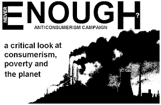
This was an anti-consumerist campaign from the early 90s and although the message is strong just like the minimalists the design and actual advertising campaign is very poor and to me this is where the are falling behind because consumerist products are being advertised, branded and packaged by world leading designers with money being continuously pumped into it. So how is something like this on the right going to capture people attentions with its simple colours and figures when companies like Nike and Coca Cola are having these bright, vibrant, extravagant campaigns. This is why I wanted to create my own campaign to promote minimalism.


Consumerism

Consumerism is a cultural model that promotes the acquisition of goods, specifically the purchase of goods, for personal satisfaction and economic stimulation. Consumerism is often mistaken for capitalism but capitalism is an economic system, while consumerism is a pervasive cultural attitude. A model combining the two is called consumer capitalism, a system in which consumer demand for goods is deliberately increased through manipulation as a means of increasing sales. The model relies on stimulating consumer desire for goods far in excess of satisfying needs. Mechanisms to do so include promotion of luxury items, new technologies and new models of existing technologies. Another method of increasing the sale of goods is Planned obsolescence which is an approach to the conception, design and production of a product, such as hardware or software, involving the intent that it should be useful, functional or popular for only a limited length of time. For many in a consumer culture, a functioning smart-phone is not adequate: If a new phone model is released they feel compelled to purchase it.


Target Audience Research:


Geographical 

80% of the population that lives in North America and Western Europe, accounts for 60% of private consumption spending. So from this stat I will try to focus on these areas In particular because that is where the highest amounts of consumption are taking place. It is hard to grasp a particular age range when it comes to consumerism, however I have chosen to focus on teens and young professional because these seem to be the most easily targeted and manipulated through marketing.

Demographic 

In terms of demographic from my Minimalism awareness campaign, I will focus on North America and Western Europe as these have the largest consumption rates by far and take up more than half of all consumption spending in the world. Reaching out to these in particular will have he biggest impact because if they began to live minimal lifestyles the change would be greatest because as their consumption rates go down and they just have what they need it enables the poorer countries to have the necessities, and things become more equal.


Links between mental health and consumerism:

Consumerism may be a major reason why psychological problems among American teens have been on the rise since the 1930s, a new study finds.

"We have become a culture that focuses more on material things and less on relationships," and this emphasis on things is affecting mental health on a societal level, said lead researcher Jean Twenge, an associate professor of psychology at San Diego State University, ABC News reported.

Twenge and colleagues analysed data collected between 1938 and 2007 on the mental health and personality of more than 63,000 high school and college students.
The researchers found that students today feel much more isolated, misunderstood and emotionally sensitive or unstable than in previous decades, ABC News reported. In addition. Teens today are more likely to be narcissistic, have poor self-control and to say they're worried, sad, and dissatisfied with life.


Identifying and Analysing Relevant Visual Examples

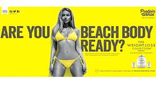
The first advertisement is from protein world and can be seen as both successful and unsuccessful, as It got a lot of media attention but for the wrong reasons, however it still got a lot of attention nonetheless. The ad shows a very unrealistic example of a woman body and the poses the question “Are you beach body ready’. This is very wrong for many reasons that being showing an unrealistic goal for women and the asking the question very bluntly ”are you ready” and implying that their product can deliver these types of results which is not the case. It is also sexist because its only aimed at women and there body expectations, and its playing on the insecurities of women to try and sell their product. In terms of the actual design of the advert it uses very strong vibrant colours which go along with the bold, blunt nature of the advert and I believe the advert did its job which was to cause controversy and bring the brand into the public eye.

The next advertisment is a colossal consumerist campaign by Nike which was called ‘Just Do It’ which was taken from murder Gary Gilmores last words which were ‘Lets do it’, which for me alread says a lot. Nike is such a powerful brand but this is most from their consumerist techniques such as using relevant pop culture such as hip pop artists and footballers to wear their products and pay them to, which then leads to people wanting and even fighting for these products. The words Just Do It are very blunt and demanding and are doing a very good job of manipulating people into buying their products.

The Final advertisment is a very different one and more towards the sought of thing I want to create myself for this project. Becasue it uses all the same techniques as the previuos advertisments however for different reasons. It is saying dont buy this jacket and give to charity to try and combabt consumerism and take a pledge to lower your consuption. This is very effective and impactful because it is unexpected that a brand would do this but to me just shows how bad we have became as consumers for something like this to be created. So this gave me a lot of inspiration to create something similar but based around a minimalistic lifestyle to combat consumerism.






Studio Brief 3: Reflective Practise


Study Task 4

Research Focus

The research focus for COP I am going to focus on is Consumerism, It is to do with society and how consumerism has became a way of life for us, and is design is helping or hindering this. It also taps in to some arguments of gender and stereotypes and how designers and advertisements are selling and portraying unrealistic body goals for people, causing self hatred and mental health problems. The Graphic discipline I am going to focus on is advertising and public awareness, I will produce and awareness campaign for the minimalistic lifestyle, contrasting to the consumerist lifestyle a lot of us live. I will use my research to look at what techniques  designers and advertisers have used to push consumerism and use these to do the opposite. The research I have collected so far is designers using different techniques to make people consume and conform such as portraying unrealistic body goals and saying heir product can fix this, from questioning people insecurities to make them conform to what they want and though the research techniques and approaches like this have been used for many years. I have also looked into artist work commenting on consumerism itself such as Barbara Kruger ‘I shop, therefore I am’.


Defining the design problem 

The design problem I face is to show people how not living the consumerist lifestyle is best for them and everyone else. Especially doing so through advertising which has pushed them for so many years in the consumerist way of life. I will try to point out the key areas it will improve their lives and mental health by following the minimalistic lifestyle. It will also be hard because consumerism has a clear thing to advertise saying this product or thing will improve your life as soon as you buy it. Whereas following-the minimalistic lifestyle will-not bring you instantaneous gratification but in the long term will make you a lot happier. The awareness campaign will highlight the problems of a consumerists lifestyle and the benefits of a minimalist lifestyle 


Client needs or requirements

This is a brief aimed at consumers to change their lifestyle to try and give them a more real and healthy lifestyle, instead of being stuck in the never ending circle of consume, brief satisfaction, bored unhappy, so consume again and then repeat. I want my campaign to be accessible because my main audience will be young professionals starting their careers and lives, which I believe my campaign will have the biggest impact on, creating a new generation of minimal lifestyles instead of a heavily consumer driven world we live in today.


Study Task 3


  • portraying our society as very material driven
  • possessions mean more than personality 
  • if you have a certain material thing you fit into a certain bracket 
  • like social tribes 


  • This piece is portraying that consumerism is a way of life and how its heightened around holiday periods 
  • showing that christmas has lost all its values, such charity, compassion and forgiveness. It has become more about person gain and material things.


this advertisement is very sexist and stereotypical
prays on insecurities of women 
portrays an unrealistic image 
some may argue it empowers women who work hard for there image


This image is very similar to the one before, portraying an unrealistic image for men 
nakes men feel insecure about how they look and being unsatisfied with the look who can effect their confidence and mental health, even though these are unachievable goals 
objectifies men 


I see this as good advertisement because there is no pressure behind it or hidden meaning 
Its using a demanding tone, however its not after money, just gratification of their work and for people to see it 
This uses the same technique as the Noisey advertisement 
However there is more reproductions behind this because if you follow the advertisement you will end up being in the army 
I feel this is unfair for men of that time because if you didn't want to join the army you would be seen as less of a man 
Something like this now a days would not work and all and would face a lot of prejudice 


Study Task 1

LCA Library
1: Consumerism: As a Way of Life, Steven H. Miles
2: Consumed: How Markets Corrupt Children, Infantilize Adults, and Swallow Citizens Whole, Benjamin Barber
3: The high price of materialism,  Tim Kasser 
4. Architecture & Design Versus Consumerism: How Design Activism Confronts Growth, Ann Thorpe
Google Books (preview)
1: https://books.google.co.uk/books/about/Consumerism.html?id=h0fjo6Gu24QC&redir_esc=y
 Alex Woolf Chrysalis Education, 2004 - Juvenile Nonfiction - 61 pages
2: https://books.google.co.uk/books/about/Work_Consumerism_And_The_New_Poor.html?id=pua-1YNkaw4C&redir_esc=y
Bauman, Zygmunt McGraw-Hill Education (UK), 1 Sep 2004 - Education - 131 pages

3: https://books.google.co.uk/books/about/Body_Image.html?id=GzBc4Evg2VYC&redir_esc=y

Body ImageUnderstanding Body Dissatisfaction in Men, Women, and Children

Sarah Grogan Psychology Press, 1999 - Psychology - 225 pages

Google Scholar
         
1:Title :Taste today : the role of appreciation in consumerism and design

Author :
LLOYD JONES, Peter ; 
Publication year :
1991
Language :
English ; 
Abstract :
An account of the concept of taste in contemporary consumer society, using critical studies from the history of art and design combined with recent advances in sociological and psychological theory of consumer behaviour. ; 
Pagination/Size :
260 ; 260 p.; ill. (some col.) ; 
Topic :
530 - BIBLIOGRAPHIE D'HISTOIRE DE L'ART ; 530-VI - 1945- ; 
French keywords :
Consommateurs ; Design ; Goût (esthétique) ; Société ; 1900-2000 ; 1980-1991 ; 
Descriptors :
Consumers ; Design ; Society ; Taste (aesthetics) ; 1900-2000 ; 1980-1991 ; 
Document type :
Ouvrage ; 
INIST identifier :
25191024 ; 
ISBN :
ISBN 0080402518 ; 
Provenance :
Bibliographie d'Histoire de l'Art ; 
Publisher :
Pergamon, Oxford
Publisher country :

UNITED KINGDOM ; 
2: http://en.cnki.com.cn/Article_en/CJFDTOTAL-BZGC201112027.htm
 Study on Designers' Responsibility Based Consumerism
3: http://www.sciencedirect.com/science/article/pii/S1740144503000111 

Websites
1: http://www.core77.com/posts/27992/Rethinking-Design-Consumerism-and-the-Environment 
2: http://www.ethicsingraphicdesign.org/integrity/mass-consumerism/ 
3:https://consumerismanddesign.wordpress.com/2013/10/29/graphic-design-and-its-role-in-consumerism/
4:  http://postgrowth.org/slowing-the-pace-of-consumerism-by-design/
5:  http://www.thecultureconcept.com/postmodern-design-style-out-of-control-consumerism
6: http://blogs.worldwatch.org/transformingcultures/design-vs-consumerism/
7: http://www.material-lab.co.uk/blog/post/is-the-anti-consumerism-movement-affecting-design/